Did-It App
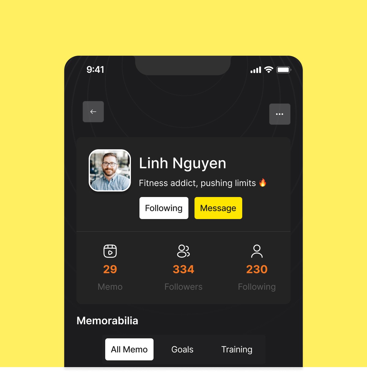
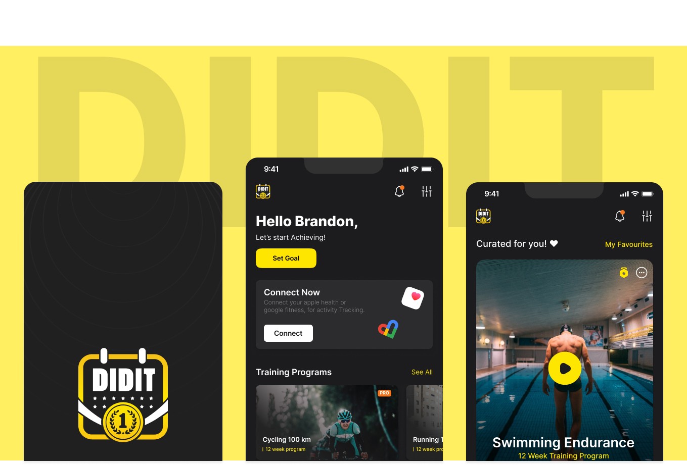
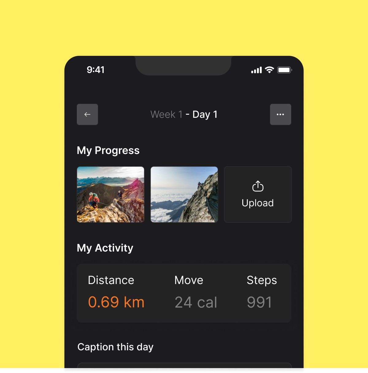
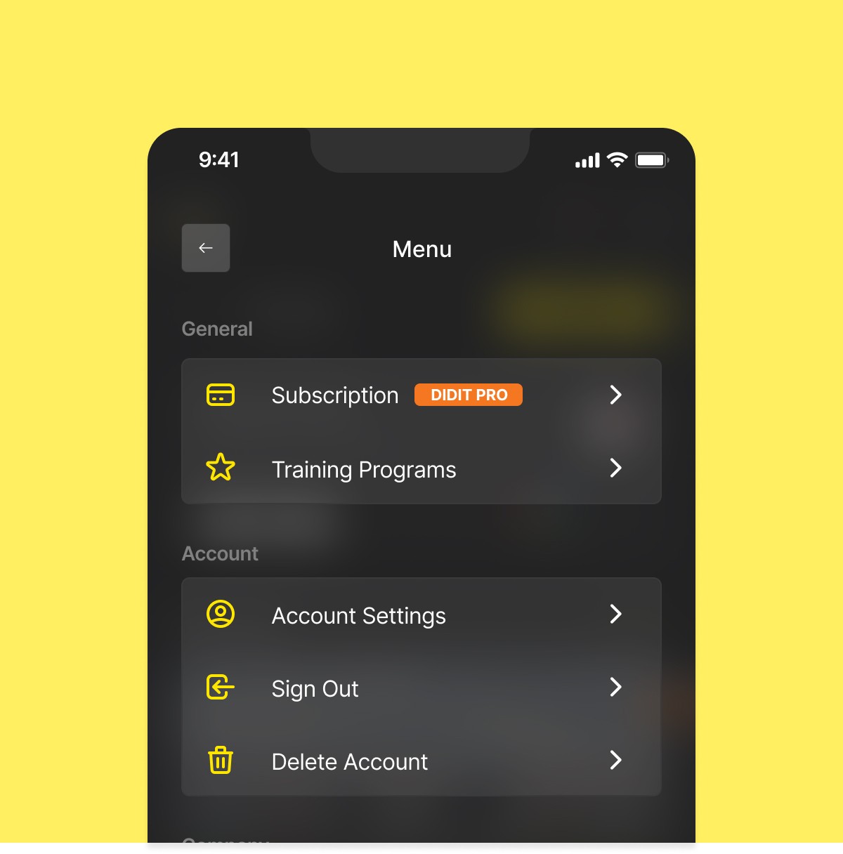
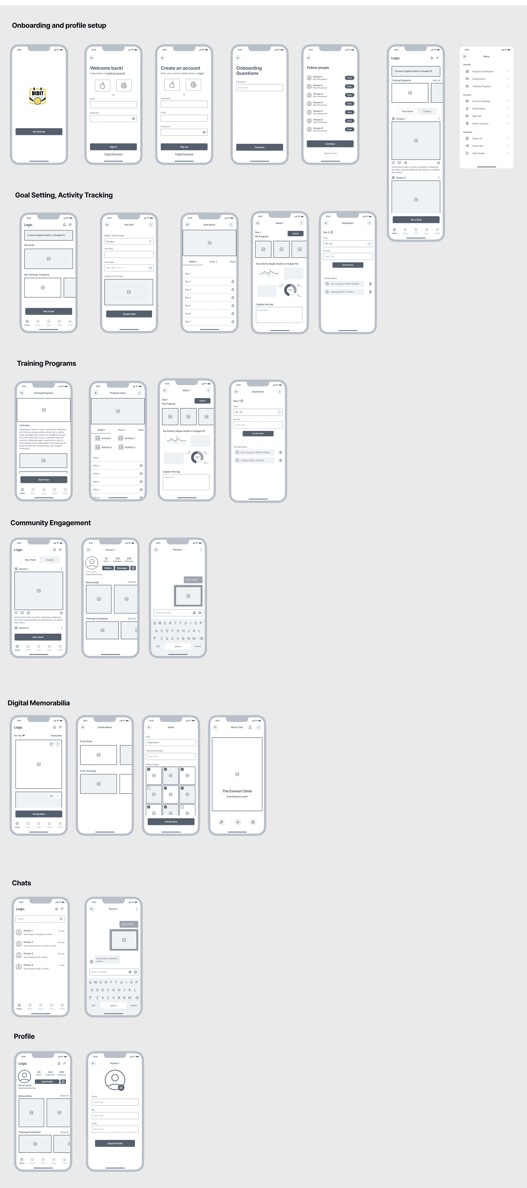
DidIt App was designed to elevate user fitness routine, seamlessly syncing with Apple Health and Google Fitness. Adding diverse training programs for swimming, cycling, and running, empowering users to set and conquer fitness goals. Sharing achievements, create lasting memories from training pictures, and experience a motivating, social fitness journey like never before.
Los Angeles, USA
2019
Fitness
$2 Million (2022)
250+
Challenge
Designing an app with these features like seamless data integration, diverse training programs, goal setting, social engagement, and personalized memorabilia creation presents several challenges. It was complex to create an intuitive and user-friendly interface that effectively communicates complex data while maintaining a visually appealing design. Balancing functionality with simplicity, ensuring cross-platform consistency, and addressing diverse user needs pose additional challenges. Moreover, crafting a cohesive and engaging user experience that encourages participation in social aspects and motivates users throughout their fitness journey requires careful consideration of usability and aesthetics.
Results
The app's refreshed design ensures a sleek, uncluttered interface for seamless navigation and easy access to key features.
A revamped onboarding process has boosted new user adoption by 35%.
Introducing personalized options has enriched engagement, contributing to a 25% rise in user retention rates.
24%
Improved onboarding process
78%
Increase in user retention
81%
Increase in time spent on app
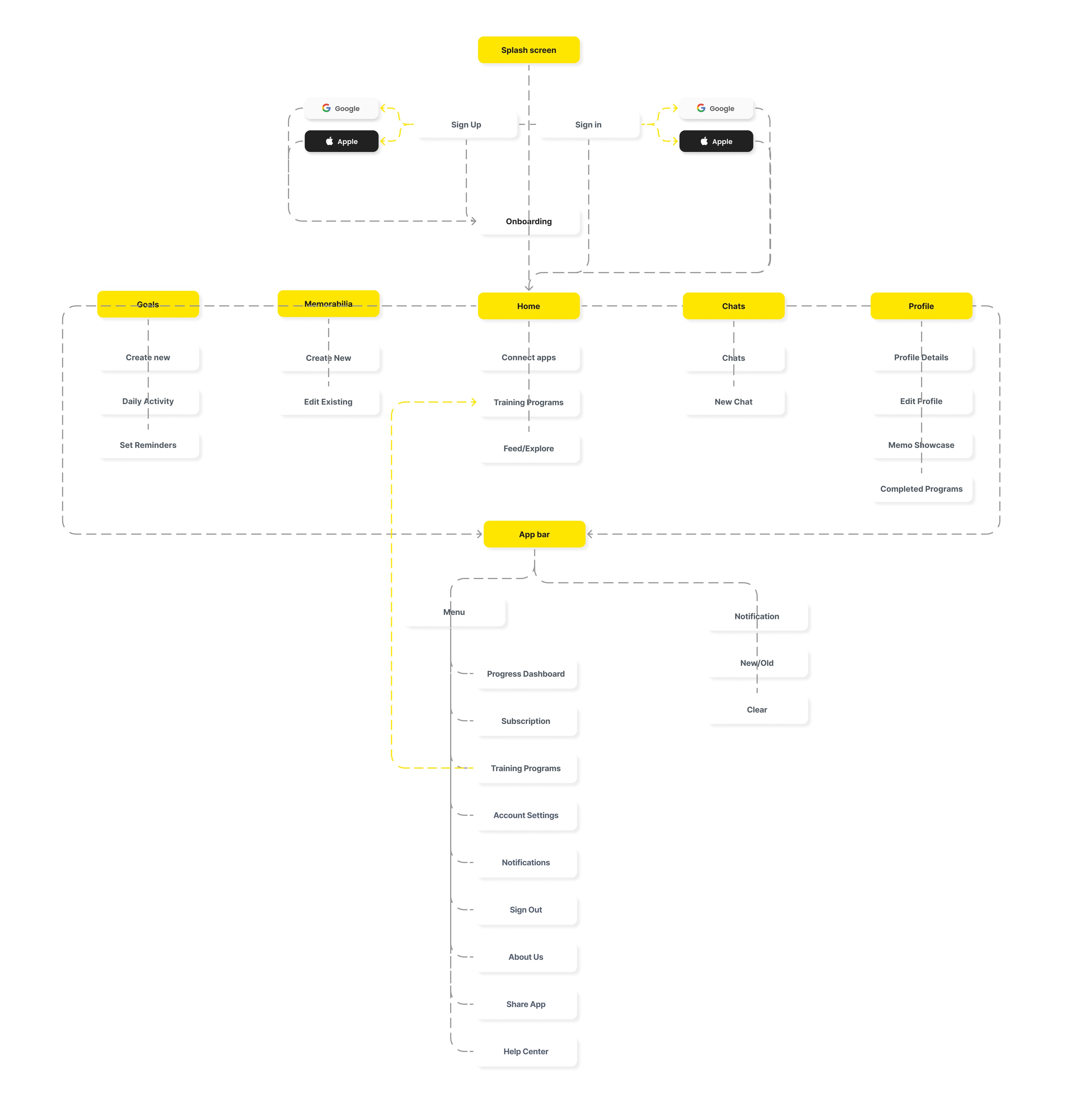
Process
Research & Analysis: We engaged in user interviews, surveys, and in-depth analysis of in-app analytics to comprehend user pain points and needs. Concurrently, we examined competitor apps and industry trends for valuable insights
Information Architecture: In response to our research, we revamped the app's navigation and content, placing priority on features and information aligned with user needs.
Wireframing & Prototyping: We crafted initial low-fidelity wireframes to visualize the updated layout and navigation, continuously refining them through iterative user feedback. Subsequently, we developed a high-fidelity, interactive prototype to assess the effectiveness of the design.
Usability Testing: We subjected the design to usability tests involving a diverse user group to validate its effectiveness and pinpoint areas for enhancement. Subsequently, we implemented essential adjustments based on the valuable feedback received.
Visual Design & Style Guide: We established a unified visual language, encompassing color schemes, typography, and iconography, to maintain consistency across the app. Additionally, a comprehensive style guide was crafted to uphold design uniformity in forthcoming updates.
“ Integrating our fresh visual branding and language, the app distinctly encapsulates our existing and target customer base, our team, and our core values. ”

Roshan Kumar
CEO, Co-founder | DidIt